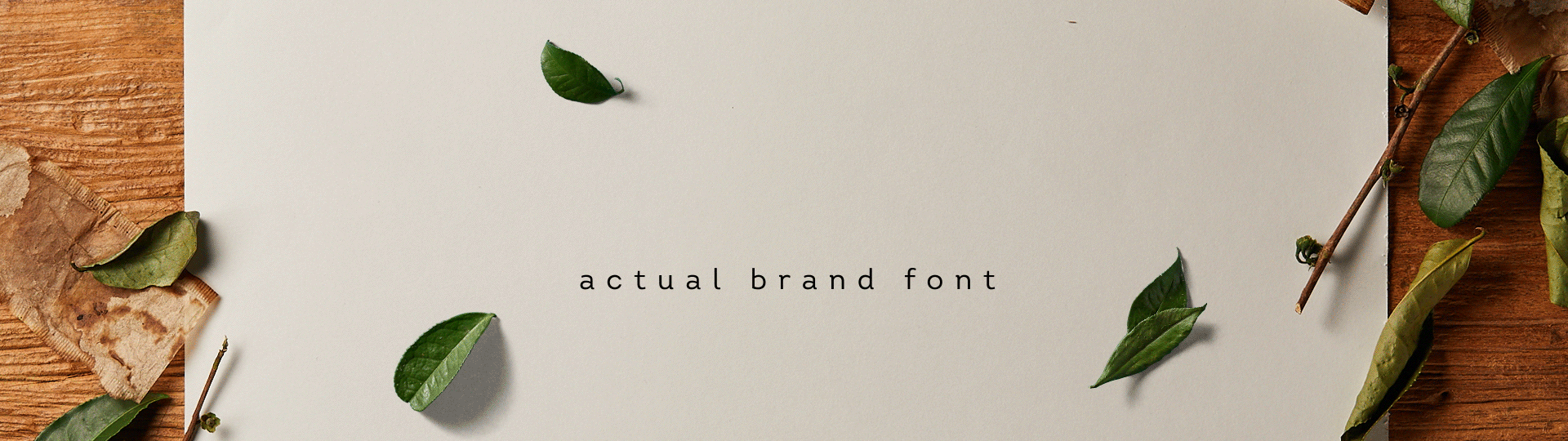
LIPTON|TEXTURE TYPOGRAPHY
+DRINKABLE
+TYPOGRAPHY
JOIN US
All of this work started with one question:
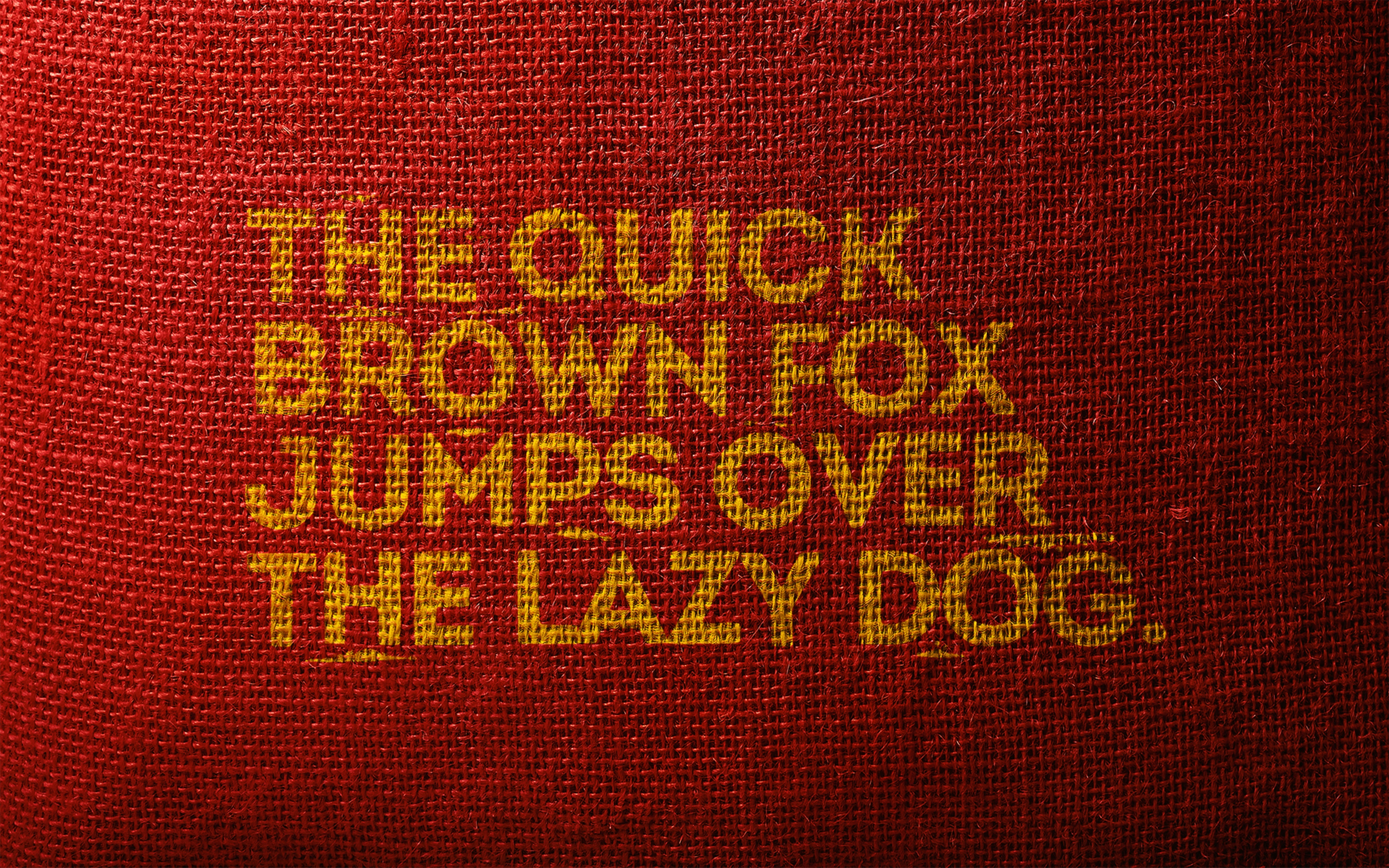
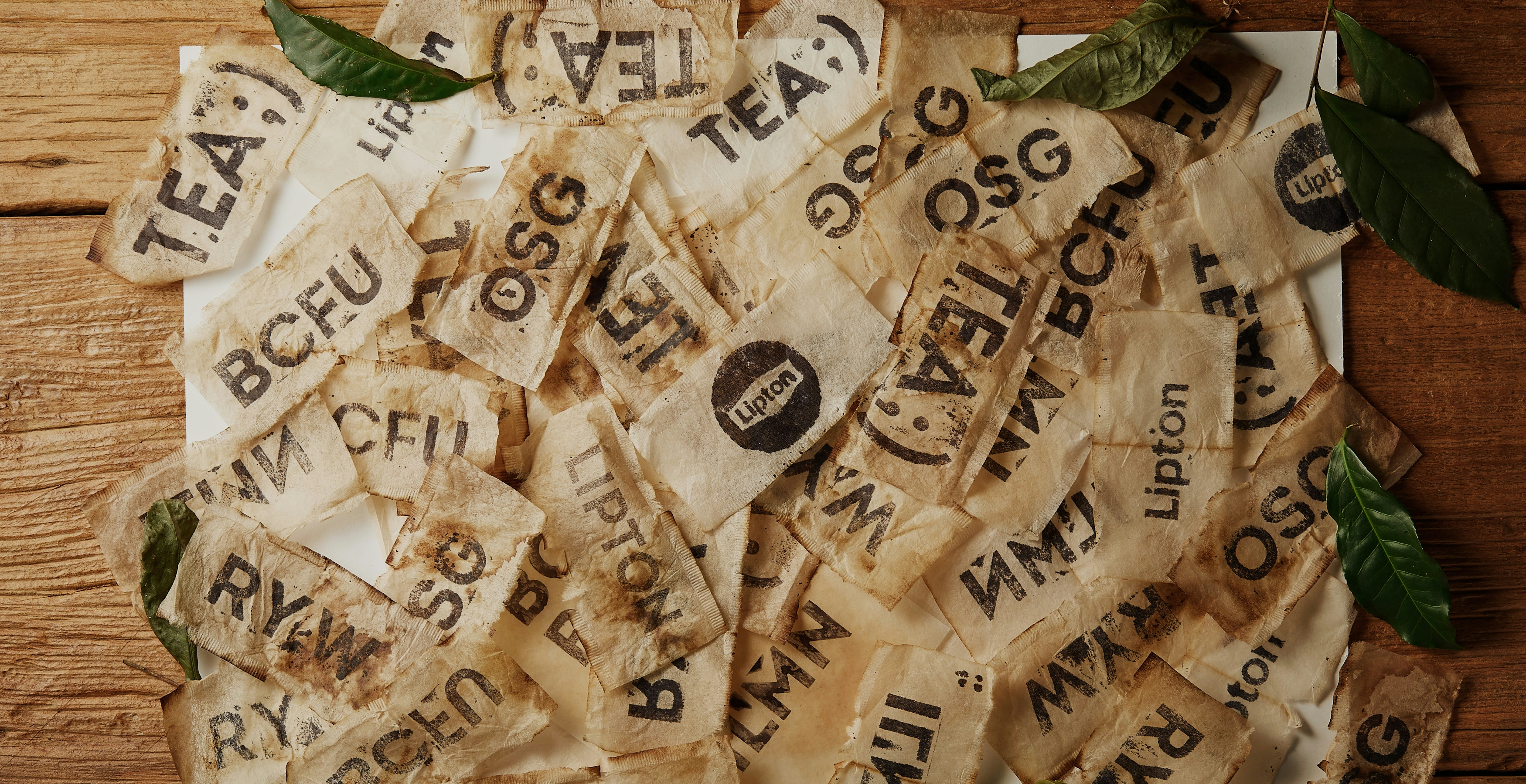
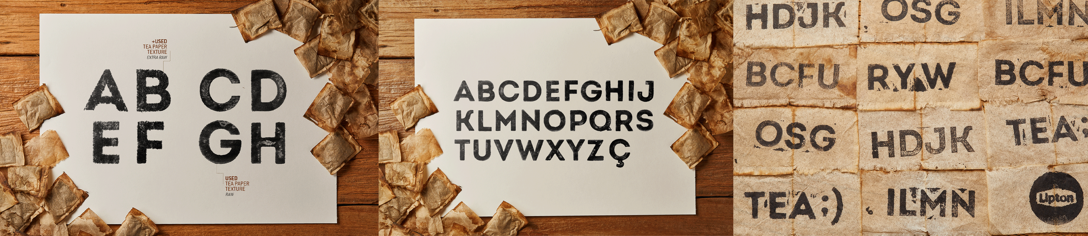
How can we propose a visual review for the Intro Lipton Font, alined to the brand's new moment? Like we do in several other project, we start a lot of tests searching for a nice graphic result, but also looking to use materials with some connection with the brand.
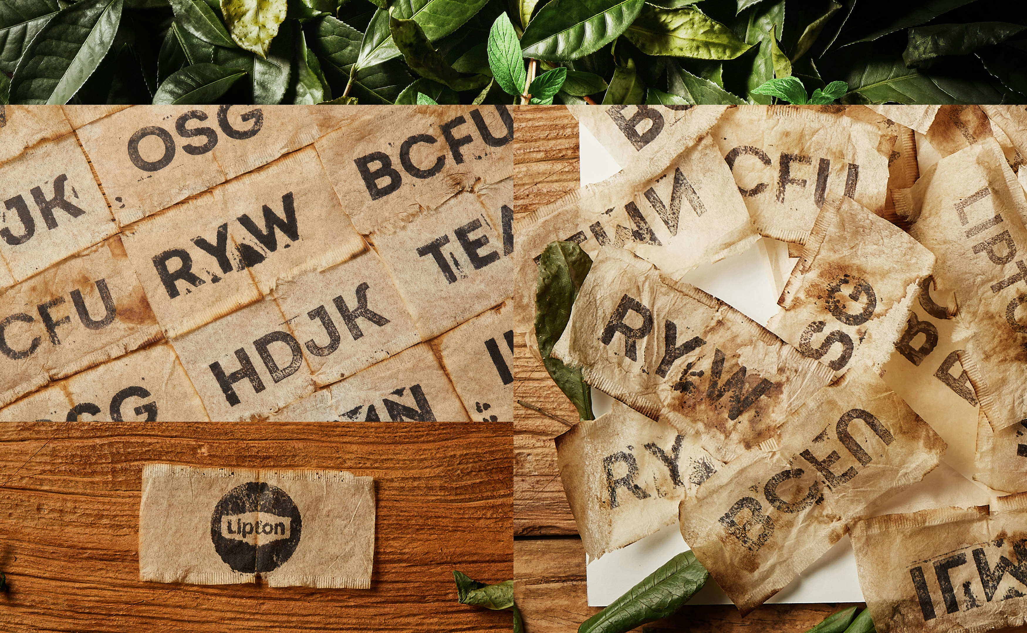
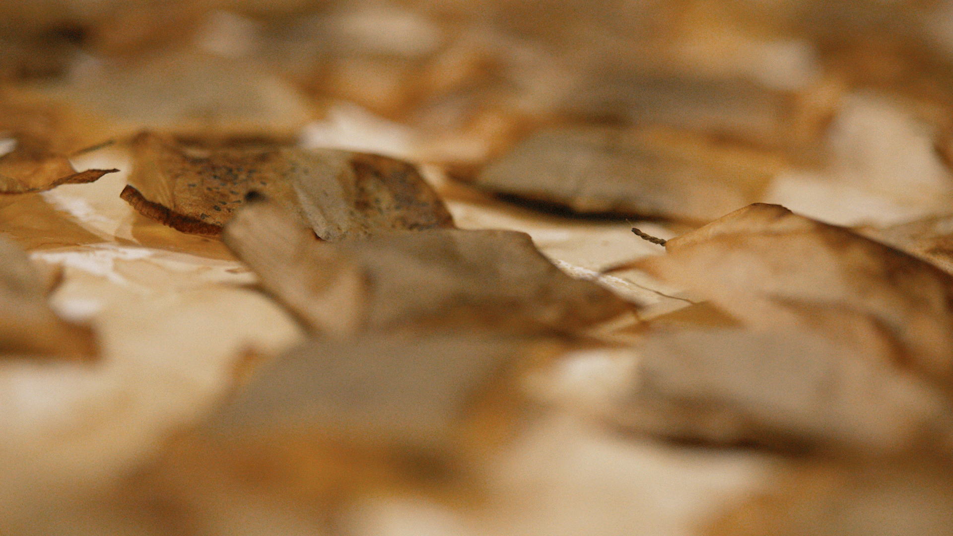
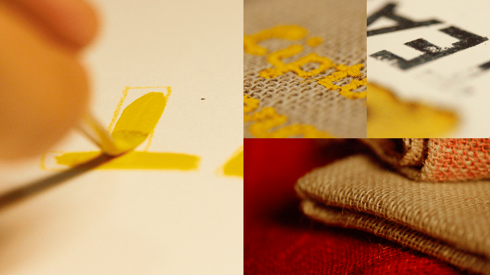
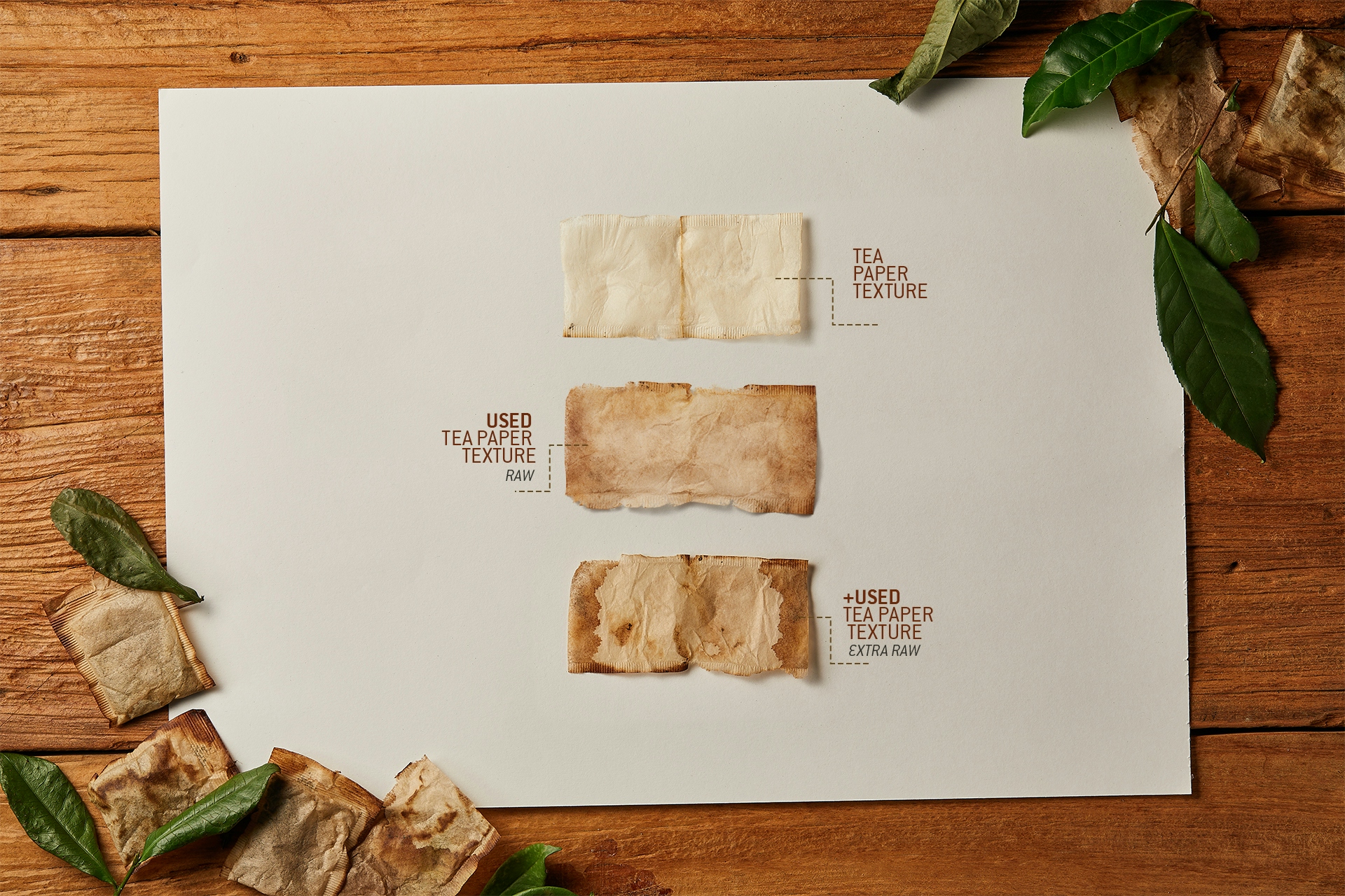
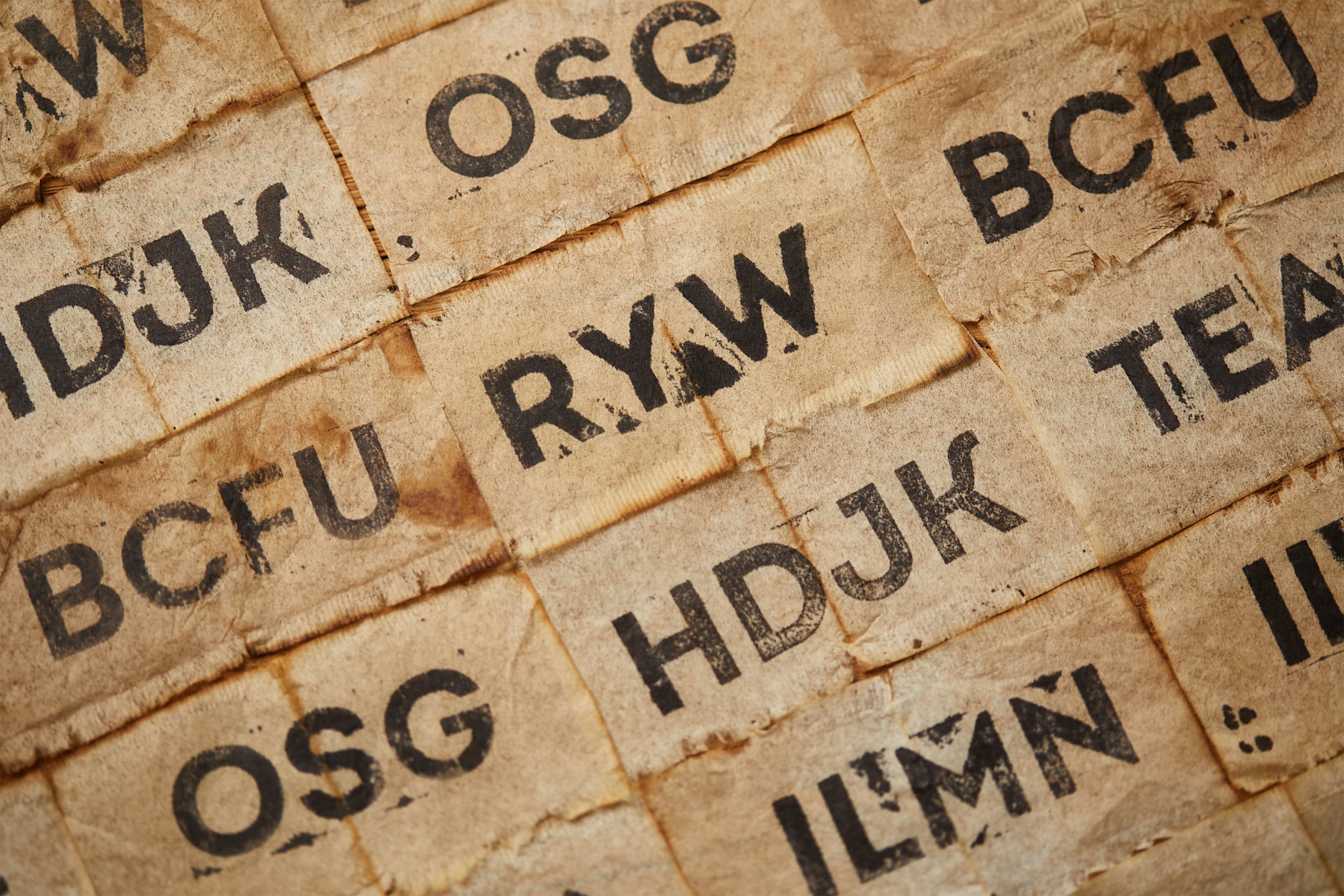
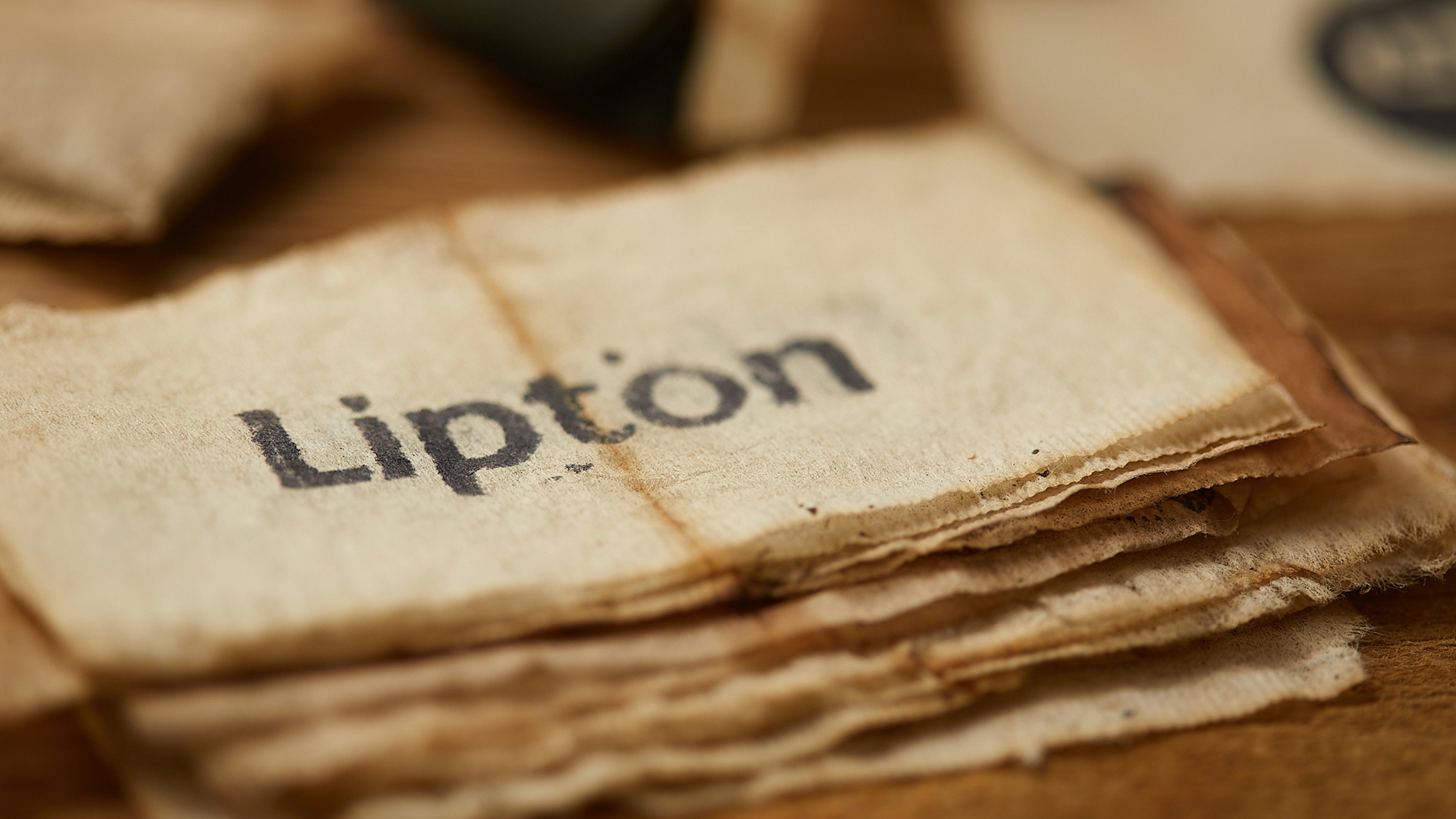
After some hours working, we use the teabag paper as a canvas to apply the font, but we proceeded testing them during various moments and selected 02 variations that bring either more or less “noise” and texture quality to the font.
We can read the results below in two versions: raw and extra-raw.
Besides the campaign, the results were always focus in several kinds of deliveries, each one with different aspects for different uses.
__