LIPTON|THE BEST OF NATURE
+DRINKABLE
+BRAND CONSTRUTION
JOIN US
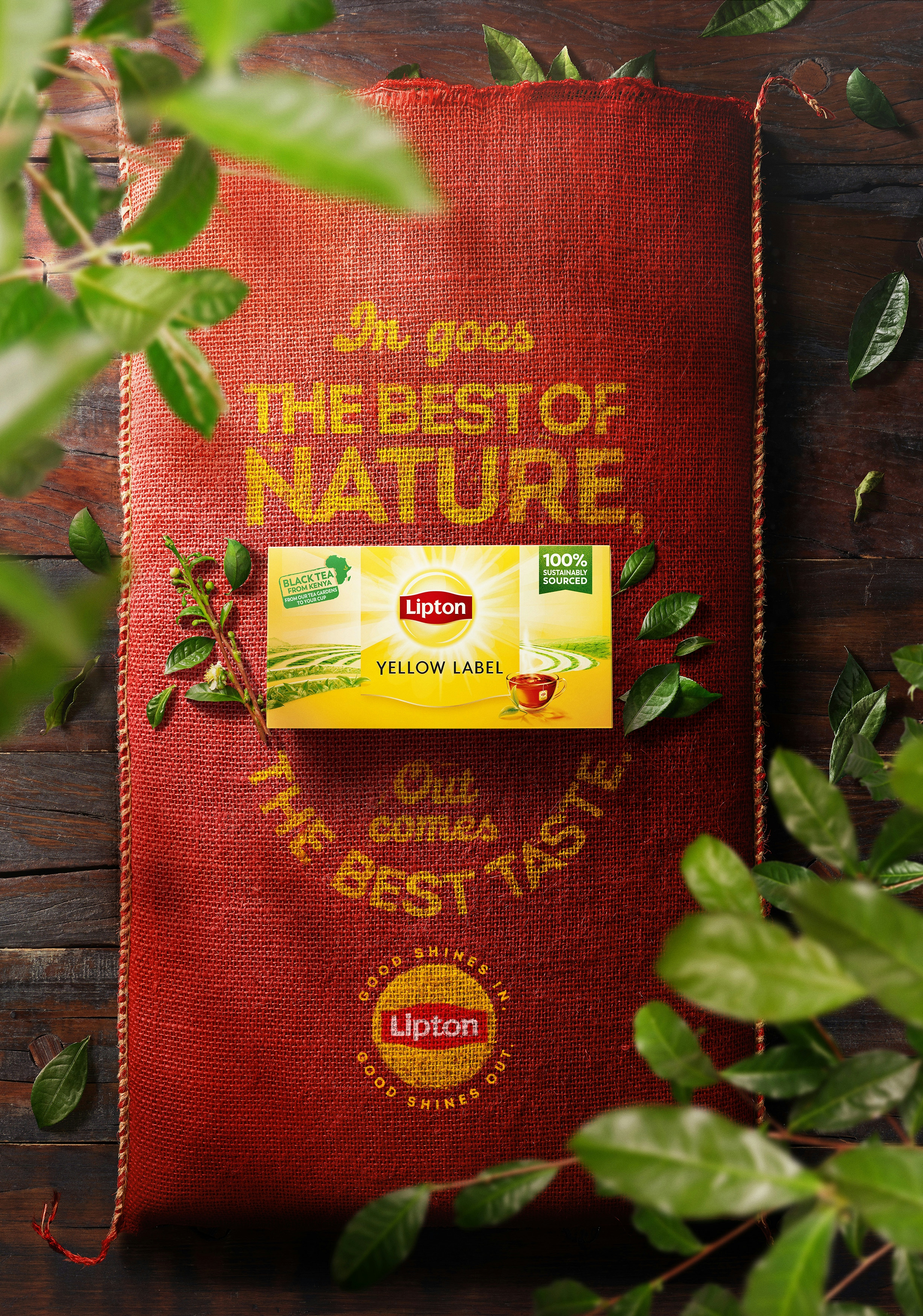
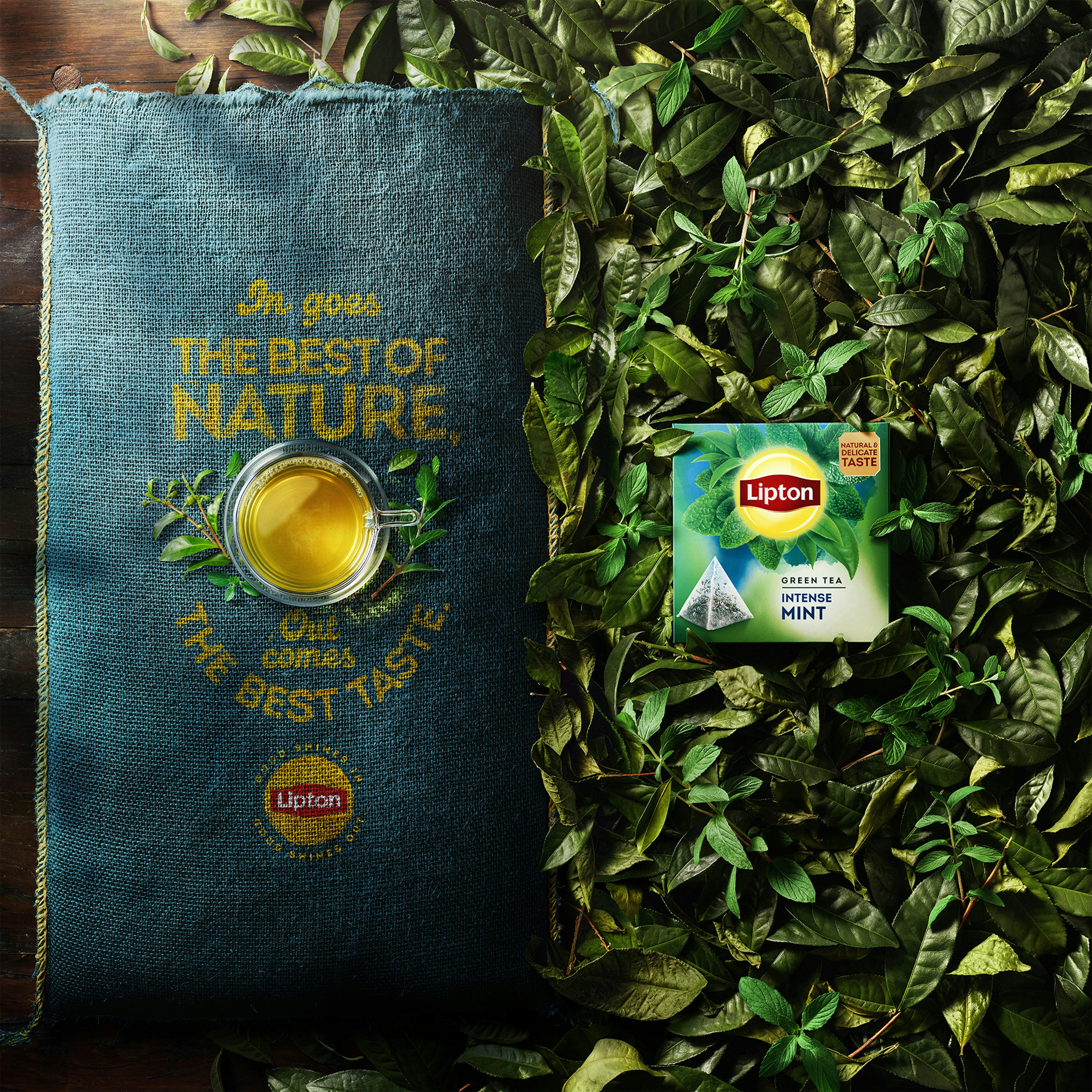
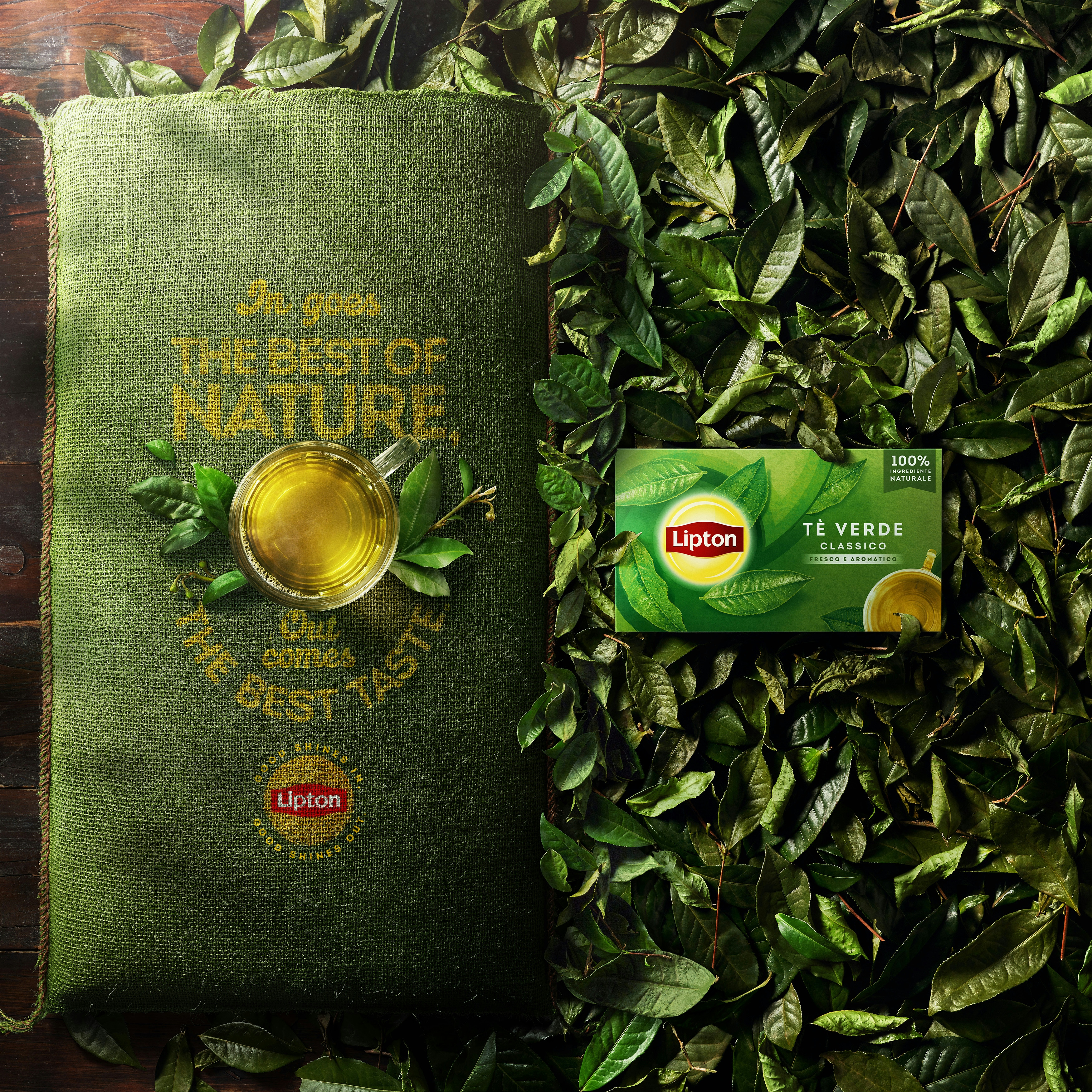
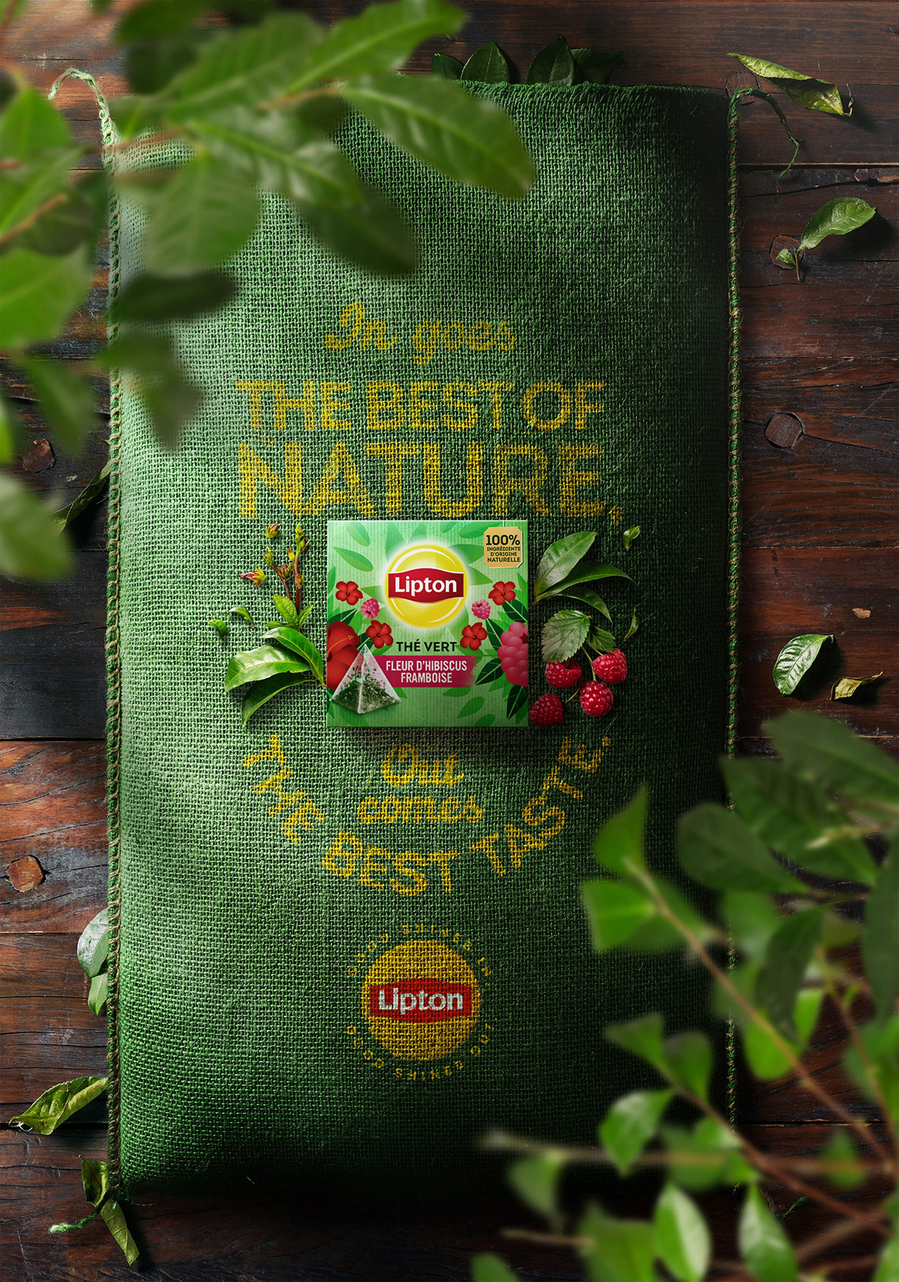
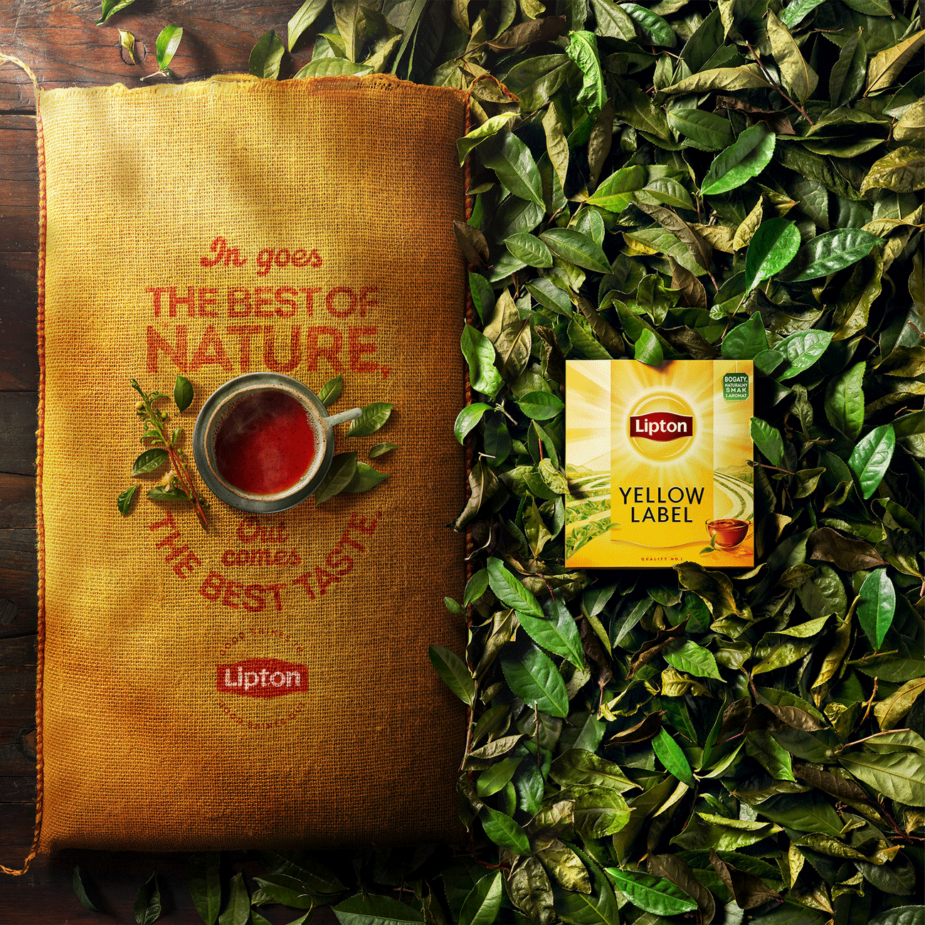
We were invited by LOLA AGENCY at MADRID to work in a incredible and strong visual campaign for the Global rebranding of the traditional tea brand LIPTON.
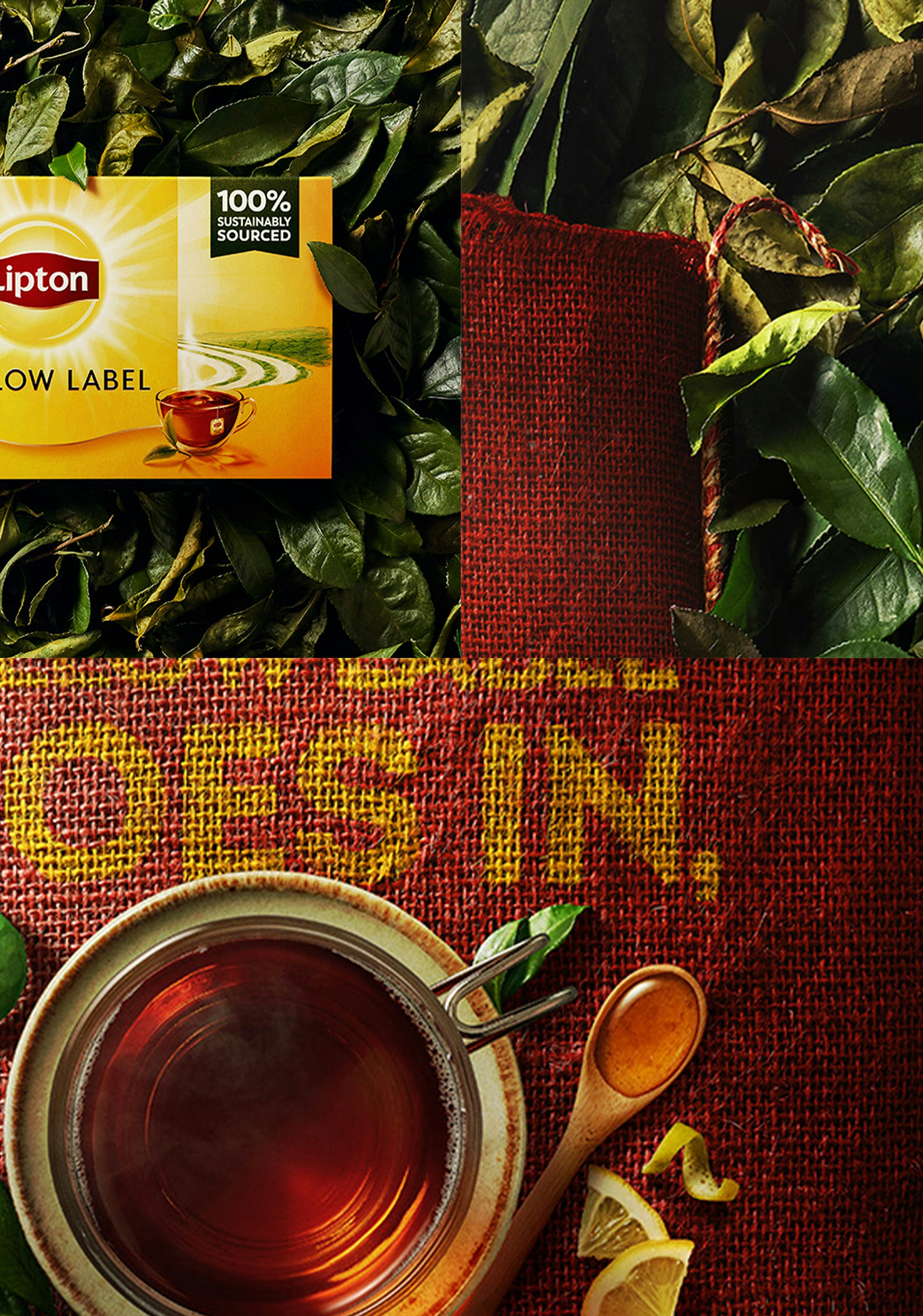
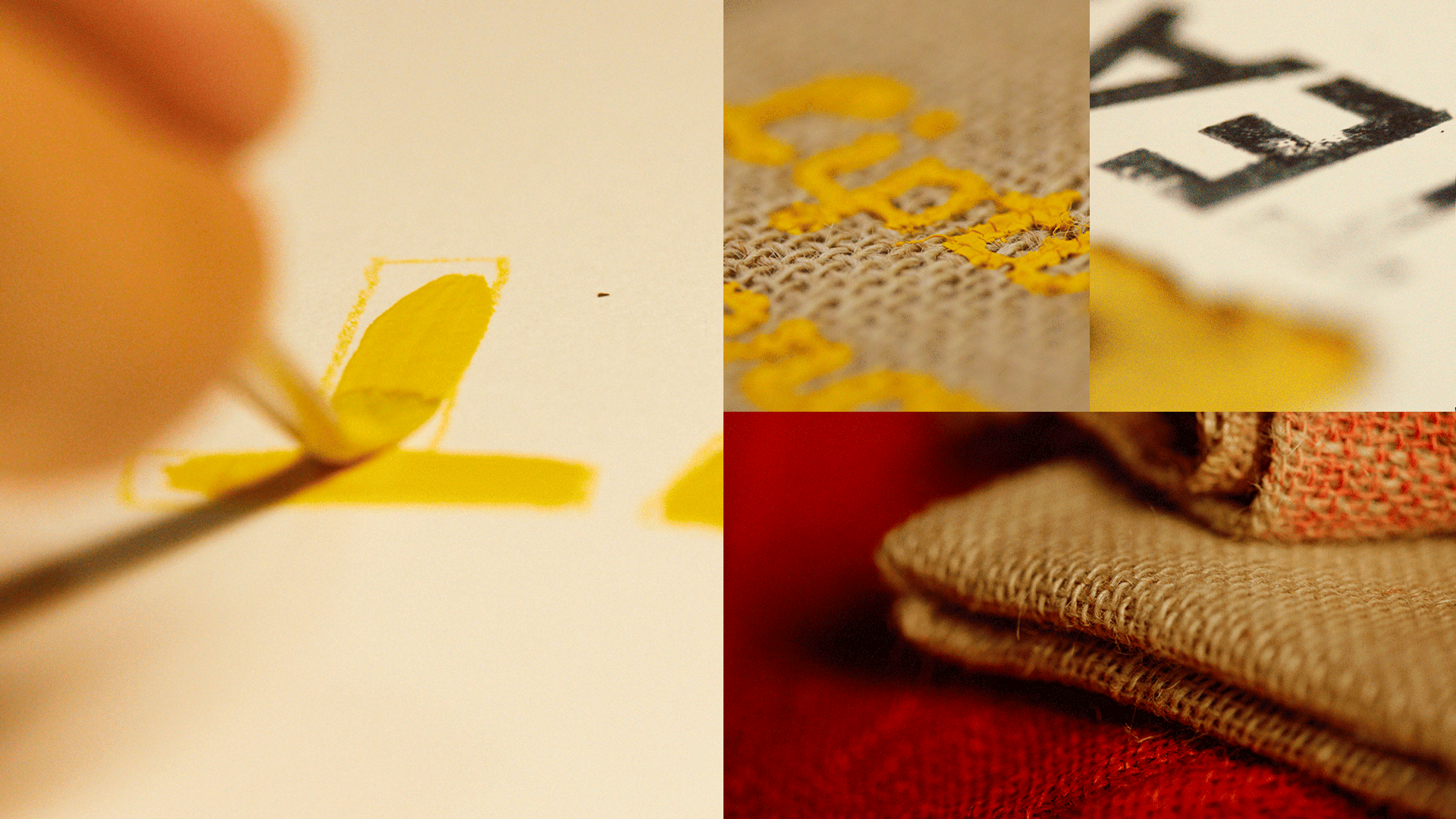
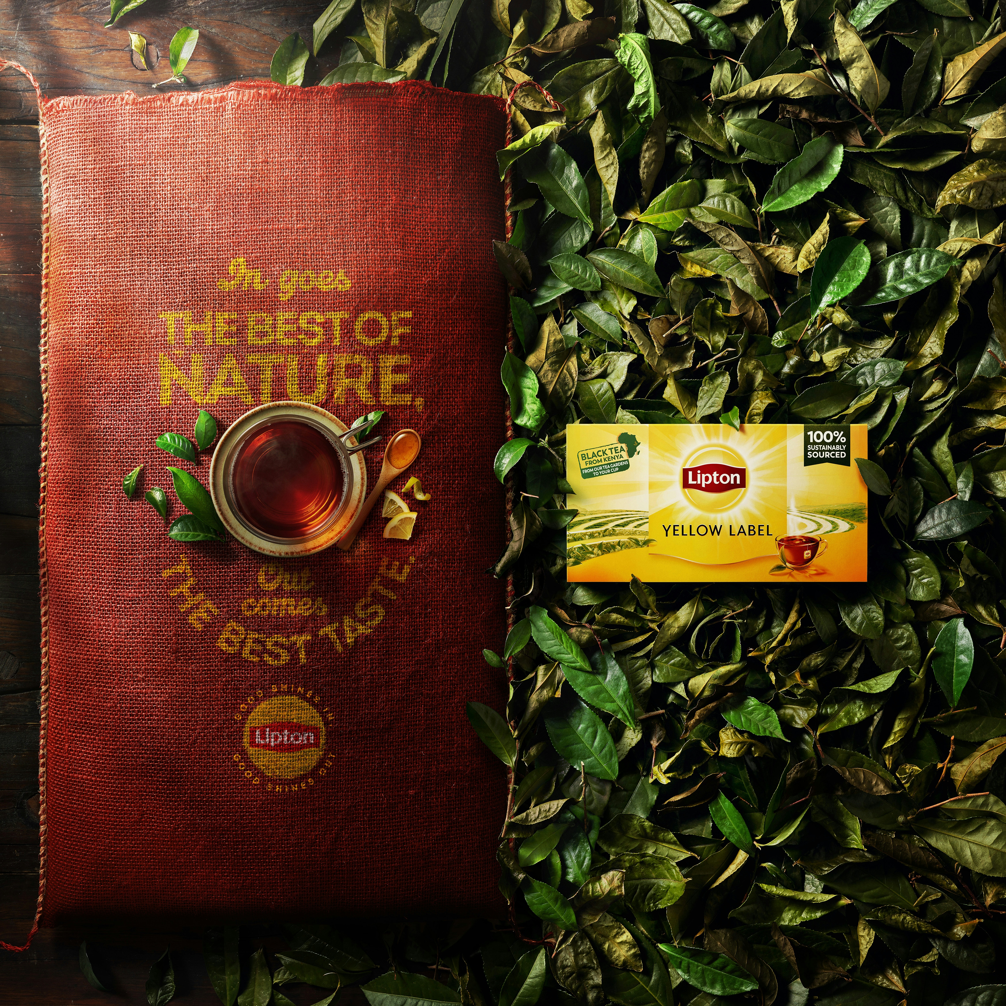
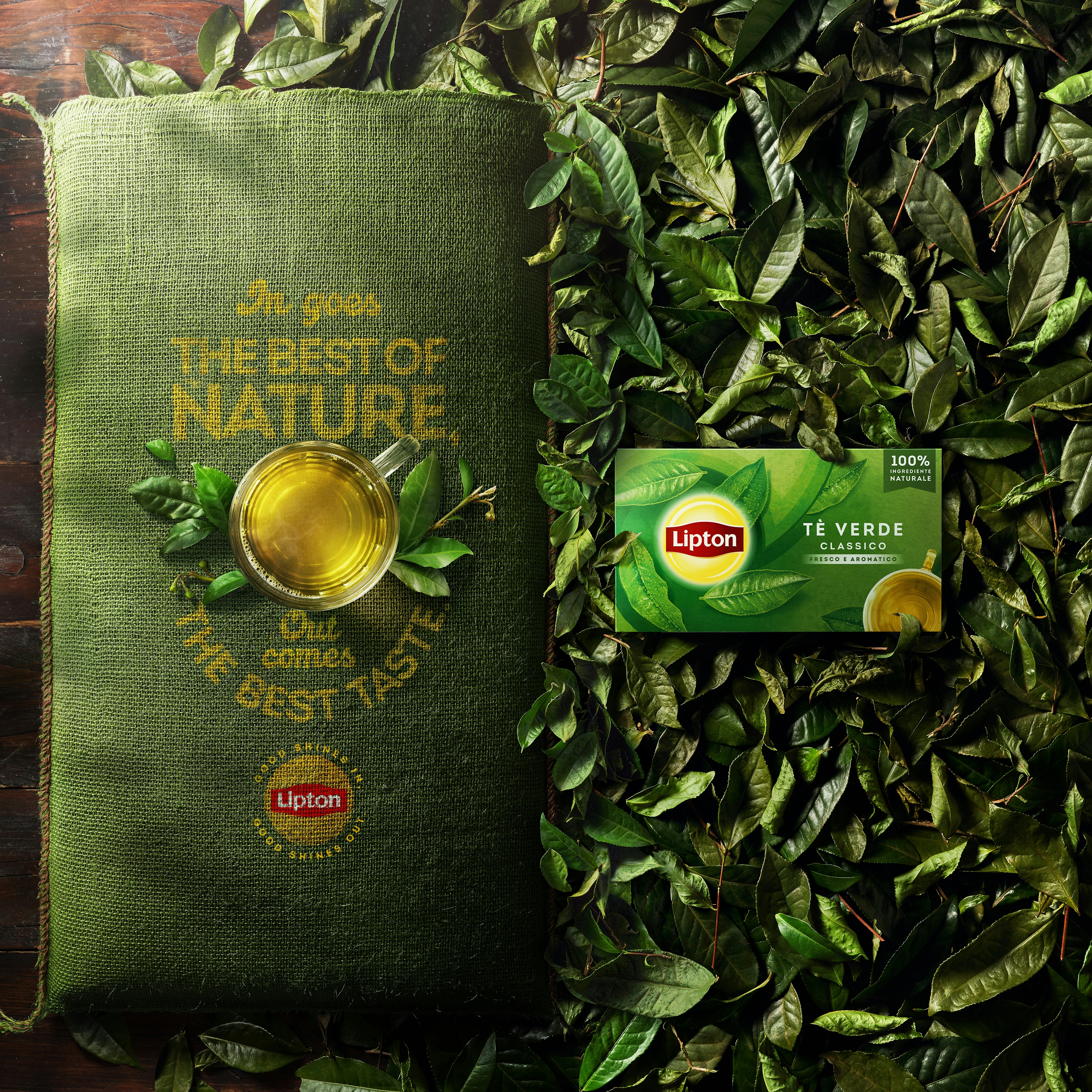
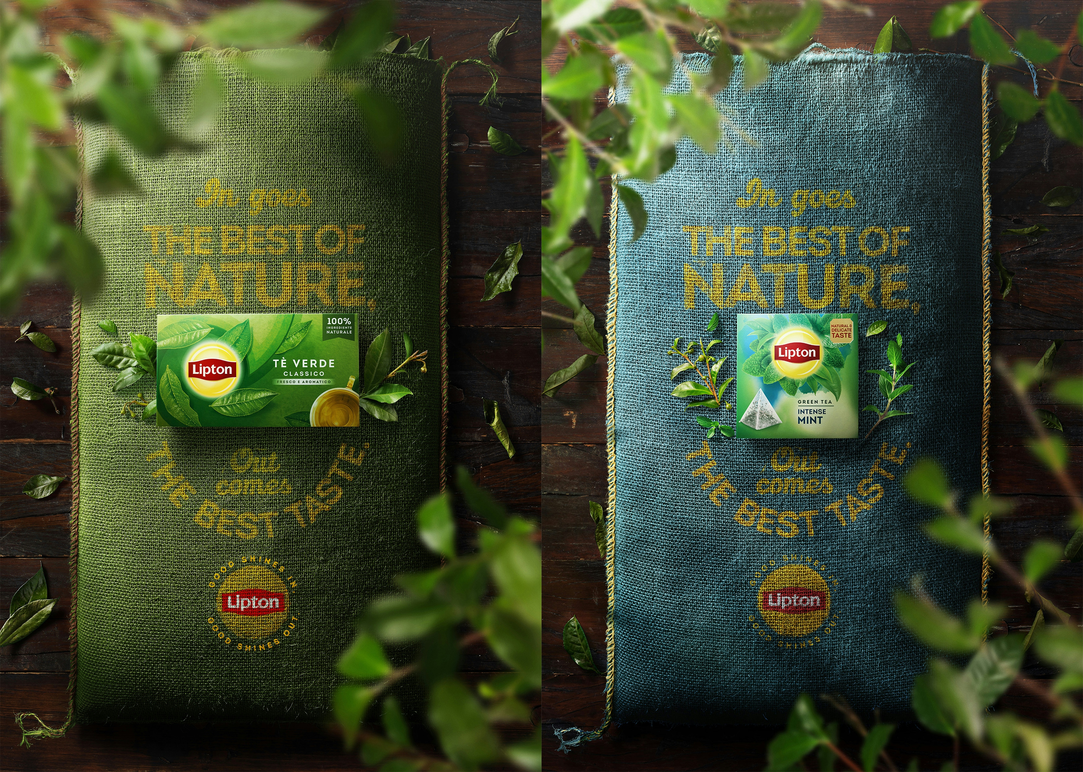
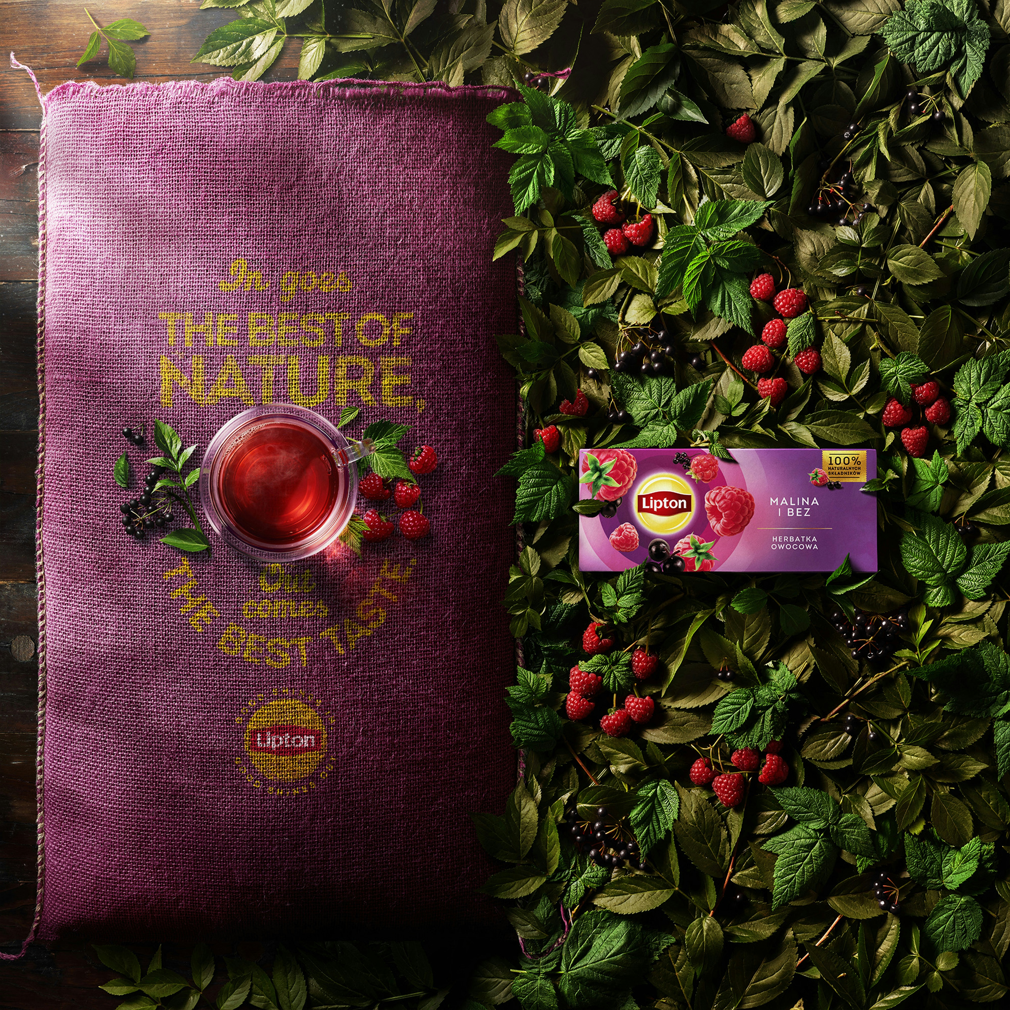
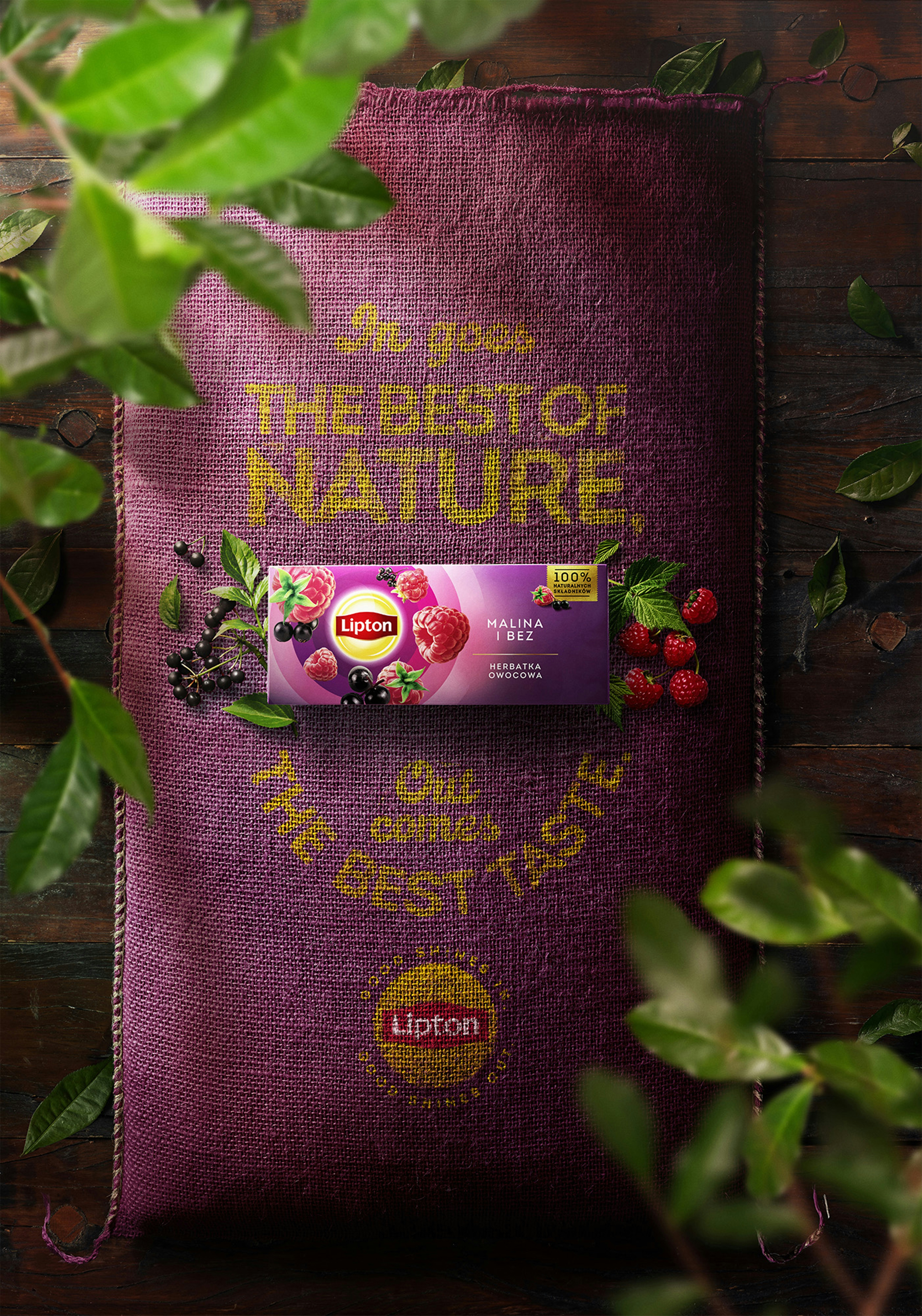
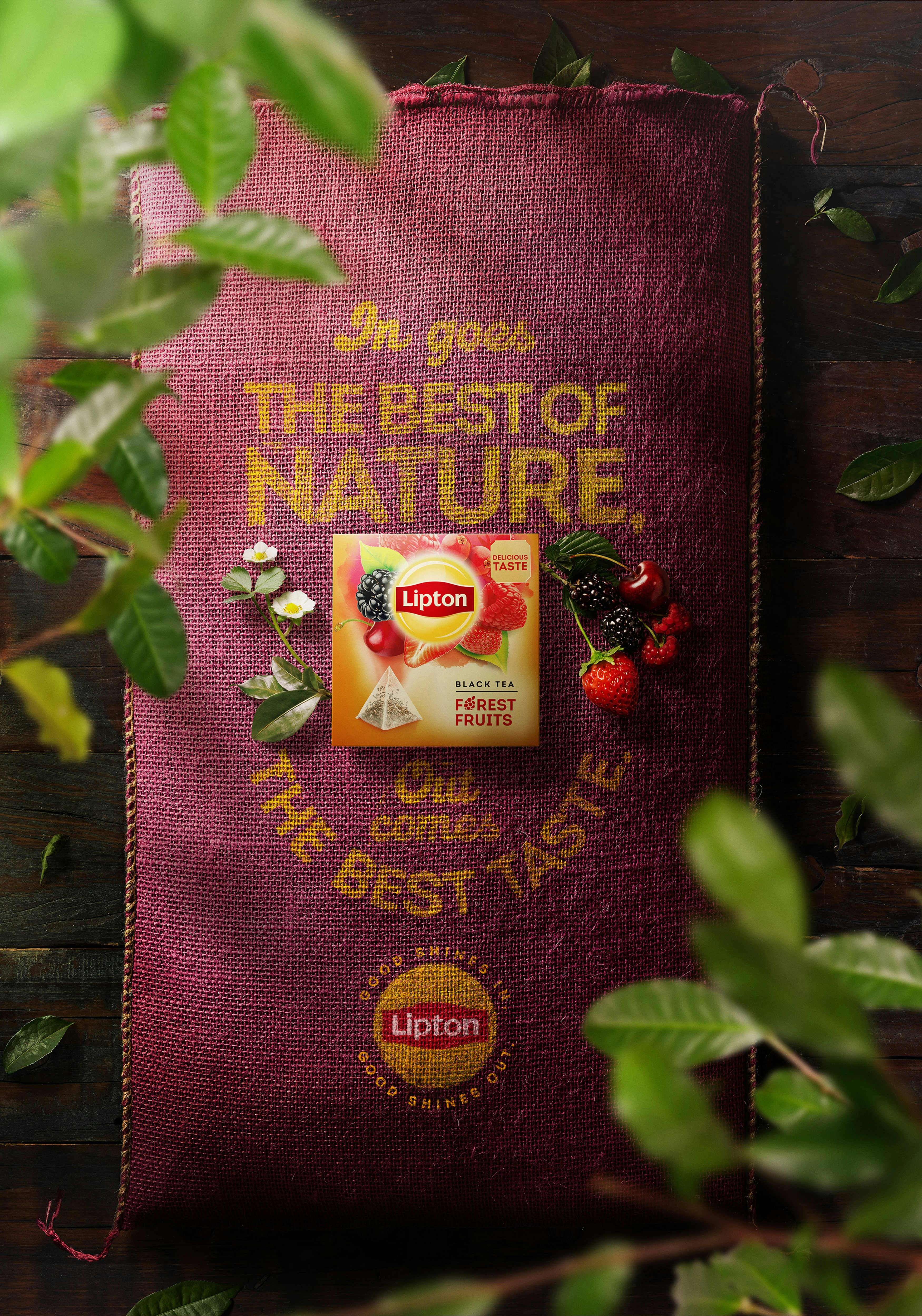
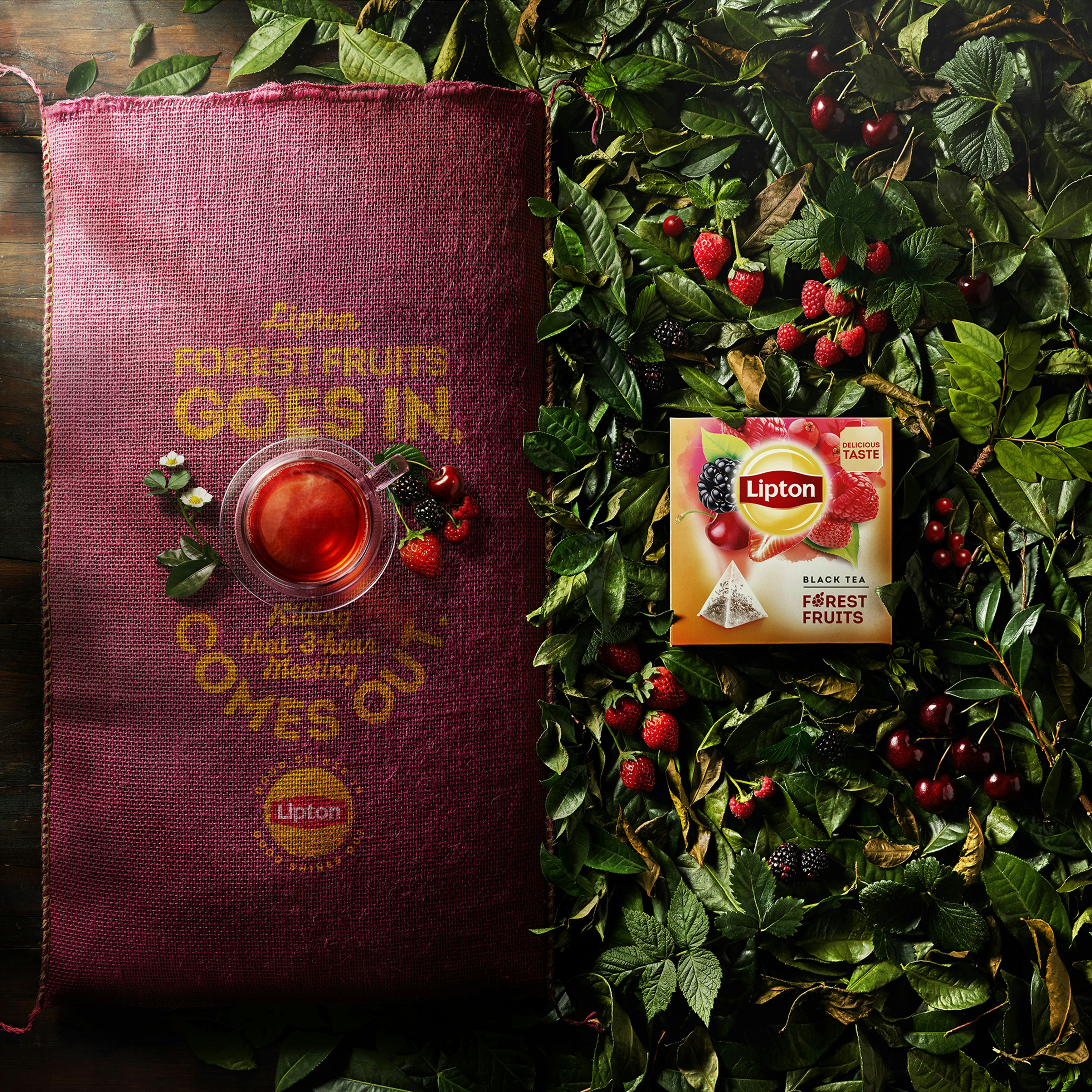
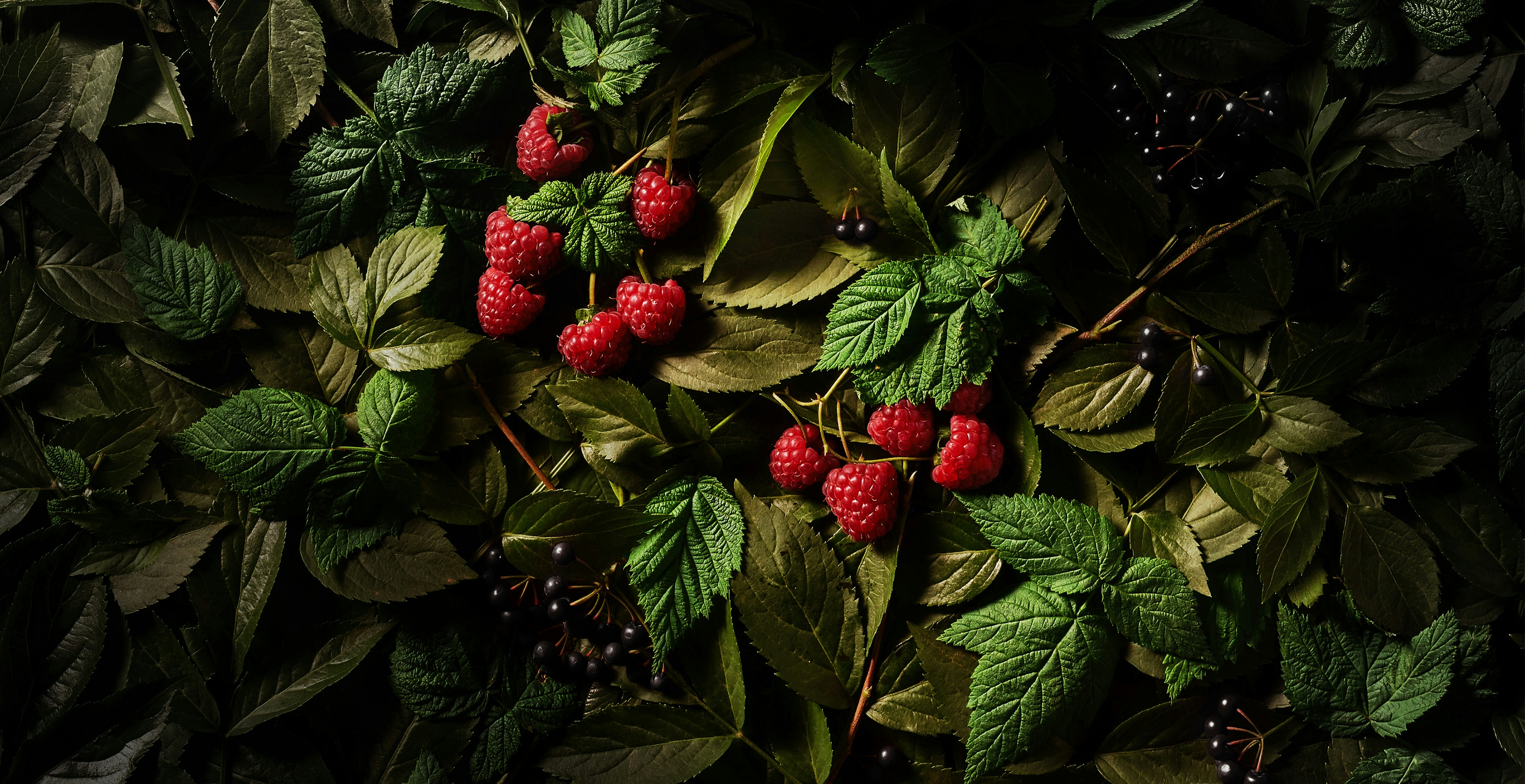
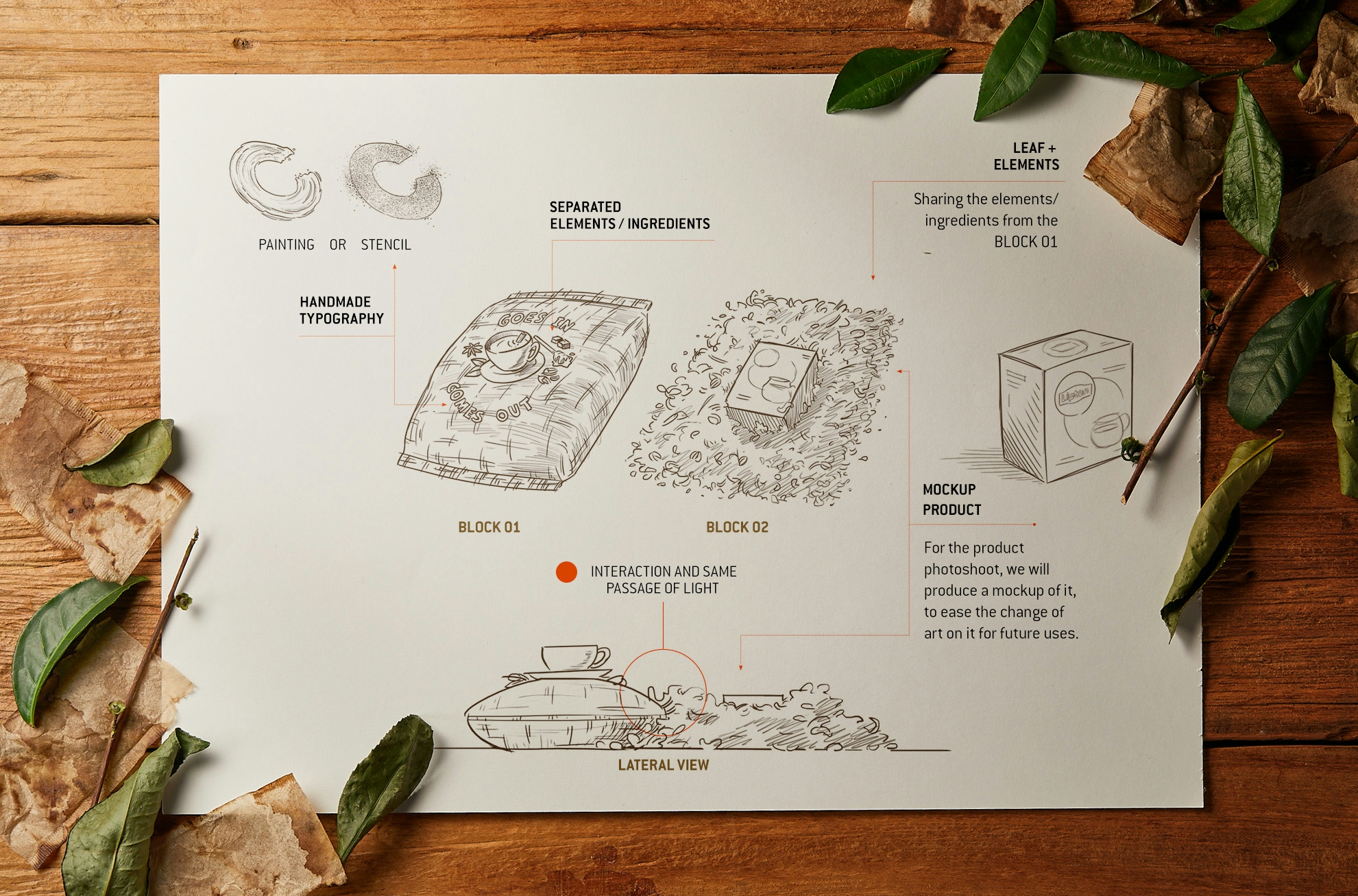
All the production of the campaign follows the main idea of bringing visually the concept that everything used in the new tea is real, natural and organic. With this concept, the studio work every detail and every aspects for this production in the same way. Our focused was bringing both visual harmony and appetite appeal for the final result.
In this case we present the overall aesthetic of the campaign and we are very happy to be sharing the final results with you, but don't forget to look at the other case, from this same campaign, but focus only at the production of the type that we produced also analogically.
Hope you all enjoy it!
___
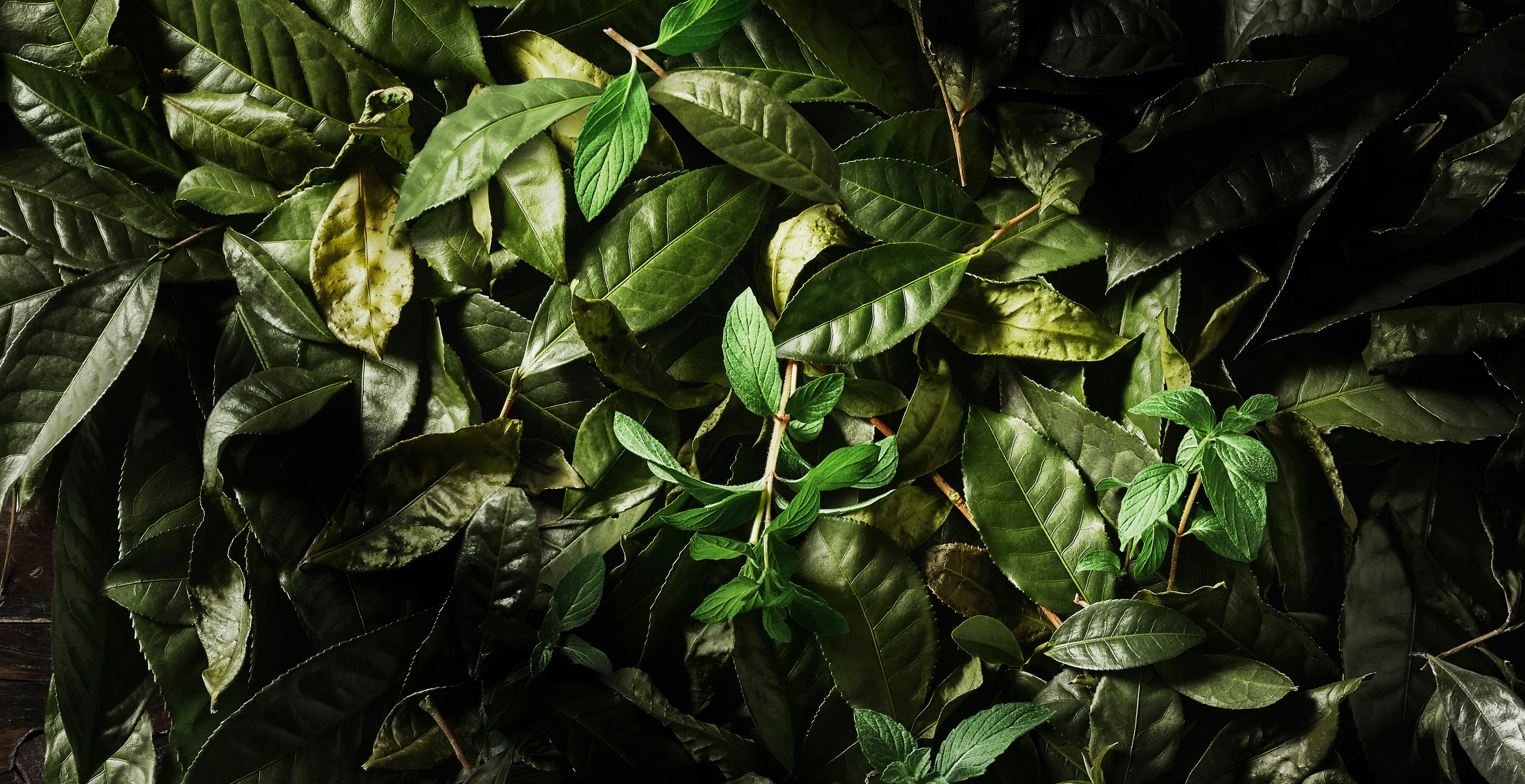
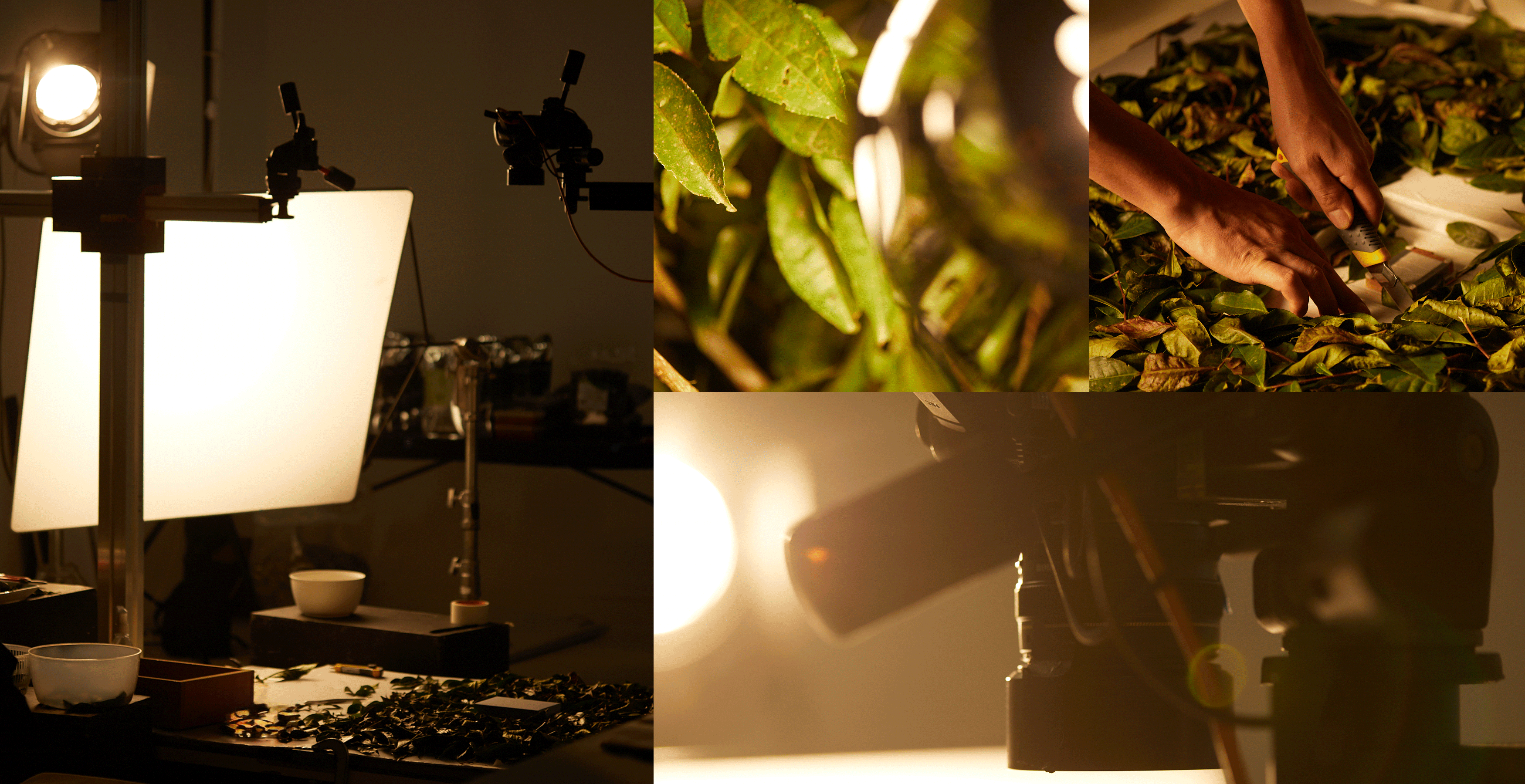
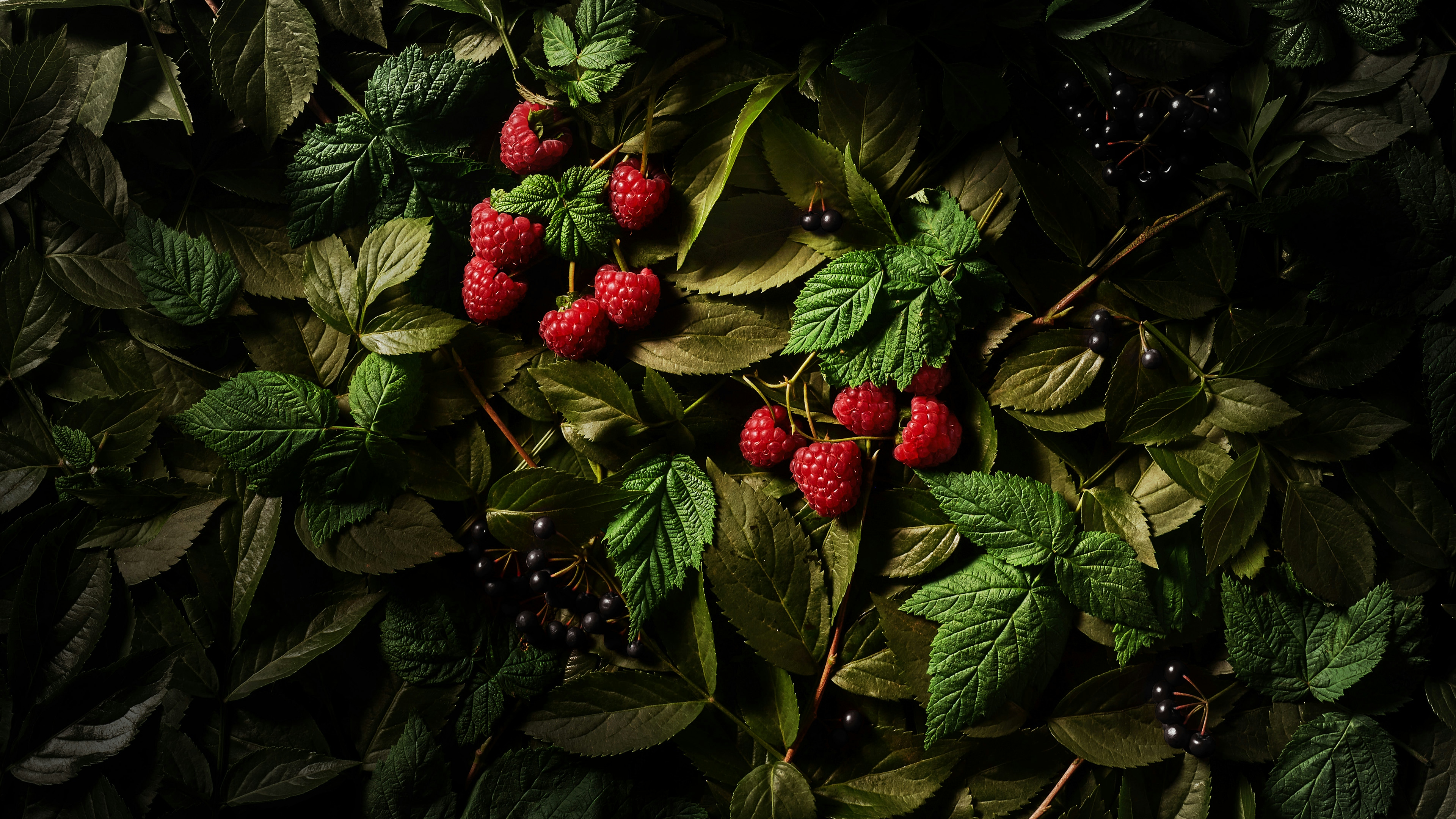
RAWNESS and NATURAL.
ALL REAL. ALL PHOTOGRAPHIC.