DANONE
|
GLOBAL REBRAND
+APPETITE APPEAL
+ILLUSTRATION
JOIN US
GLOBAL REPOSITIONING OF DANONE
How to reposition a global brand with over 100 years of history, and a reference in the segment?
This was the enormous challenge that TÁTIL Agency took on, and we had the honor to participate as almost exclusive partners in this project that involved several countries and many deliveries. The result was the fruit of the performance of all areas of PICT, and it brings us a lot of pride.

PARTNERS FROM THE BEGINNING
As a starting point for this project, we collaborated with the creative team of the agency in developing the new graphic system of the packaging, which brought a GLOBAL alignment and the possibility of local adaptations. Below are the variations made for the three stripes that are already a DANONE brand identity on the packaging, chosen according to the regional positioning of the brand.

TRADITIONAL ILLUSTRATIONS
FOR A TRADITIONAL BRAND
The language proposed by the creative team of the agency brought a range of variations of traditional watercolor illustrations for all fruit flavors. Like the stripes, we had some variations within this traditional production, some more realistic, others less. After developing the language, we moved on to the actual production, and as always, making all choices in collaboration with the Tátil team.
In total, there were nearly 100 deliveries of illustrations, including watercolors and vectors that we will showcase later on.
REAL FARMERS ON PACKAGING
For the yogurt line in Romania, the brand's proposal was to highlight local producers, featuring each of the main partner families of DANONE on the product packaging. The language was descriptive, clean, and aimed to maintain the identification of each character within the packaging. Following the faces from the photos, we drew scenes that translated the production of each family, contributing to the storytelling of the families in the DANONE yogurt line in Romania.

PHOTOGRAPHIC PRODUCTION
The entire photographic production, especially, involves the preparation of the products. After all, these are yogurt flavors and consistencies that DANONE does not have in Brazil, and we needed to develop them before moving on to photography.
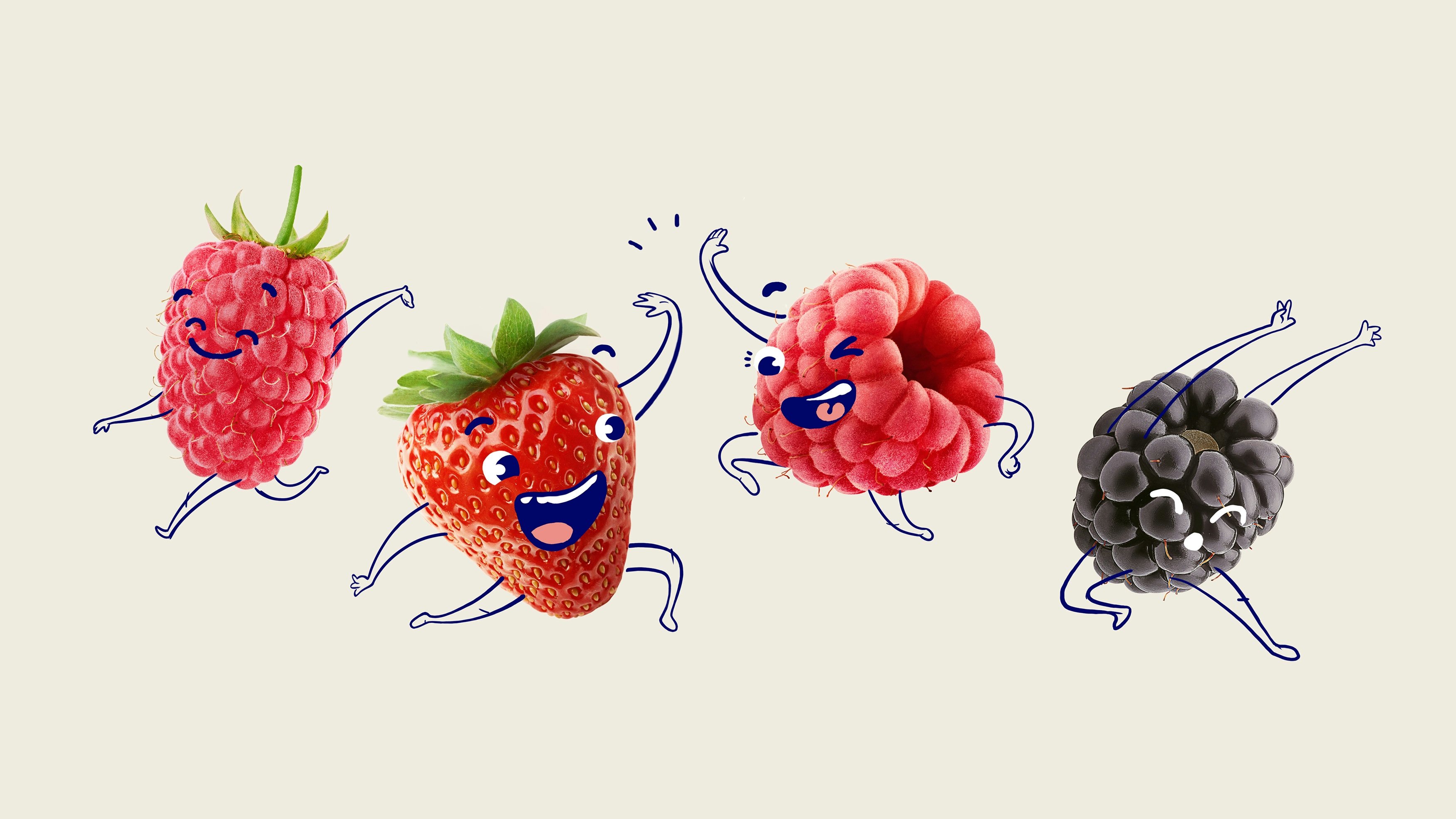
KIDS LINE
For the entire product line targeted at children, we had a different production, featuring illustrations designed to capture the attention of the little ones. Using fruits as the foundation for the characters' bodies, we added arms, legs, and expressions to make the flavors of the products more appealing to the younger age group.


